
Market visualization
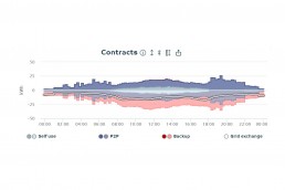
In order to experience the market events live, a visualization of the local energy market was developed by Fraunhofer FIT as part of our research project. Various KPIs are displayed and graphically prepared. The events on the marketplace and thus the effect of the local energy market are illustrated over time.
You can see any discrepancy between the forecast and the actual production of energy. In trading, a distinction can be made between how much energy was traded at which network level, how much the price is, how many transactions have taken place and what local rate is achieved in each case.
In addition to an overview of the entire local energy market, the trading results of individual participants can also be observed by selecting the relevant participant in the drop-down menu.
The measuring devices installed by the participants, which record their electricity consumption or generation, are the data base for the visualization. The “Edge Device” developed by egrid then forwards it to the trading platform, which was developed by Siemens.